Why some footage doesn’t attract the viewer in spite of the interesting action in them, while others look magnificent even without a strong sense?
It's all about a well-built composition. It works like a mathematical equation. If you calculate everything correctly, you’ll get a positive result.
What is Composition?
In a nutshell, a composition is a specific arrangement of objects in the frame. This rule applies primarily to the visual arts but is also widely used in photography and video and film production. Compliance with the rules of composition in the shot has a hidden, but powerful effect on the viewer.
As a videographer, you must know all the secrets of how to correctly place objects in the frame, to be able to build a composition.
In the film industry, a whole team is working on the composition. But using the knowledge of basic compositional rules, you can shoot an ordinary video or indie film to make it more spectacular. That's what you want, isn't it?
One of the main compositional rules is the rule of thirds. Following this important rule makes the picture visually attractive, harmonious and pleasing to the eye. Let’s dive into it.
What is the Rule of Thirds
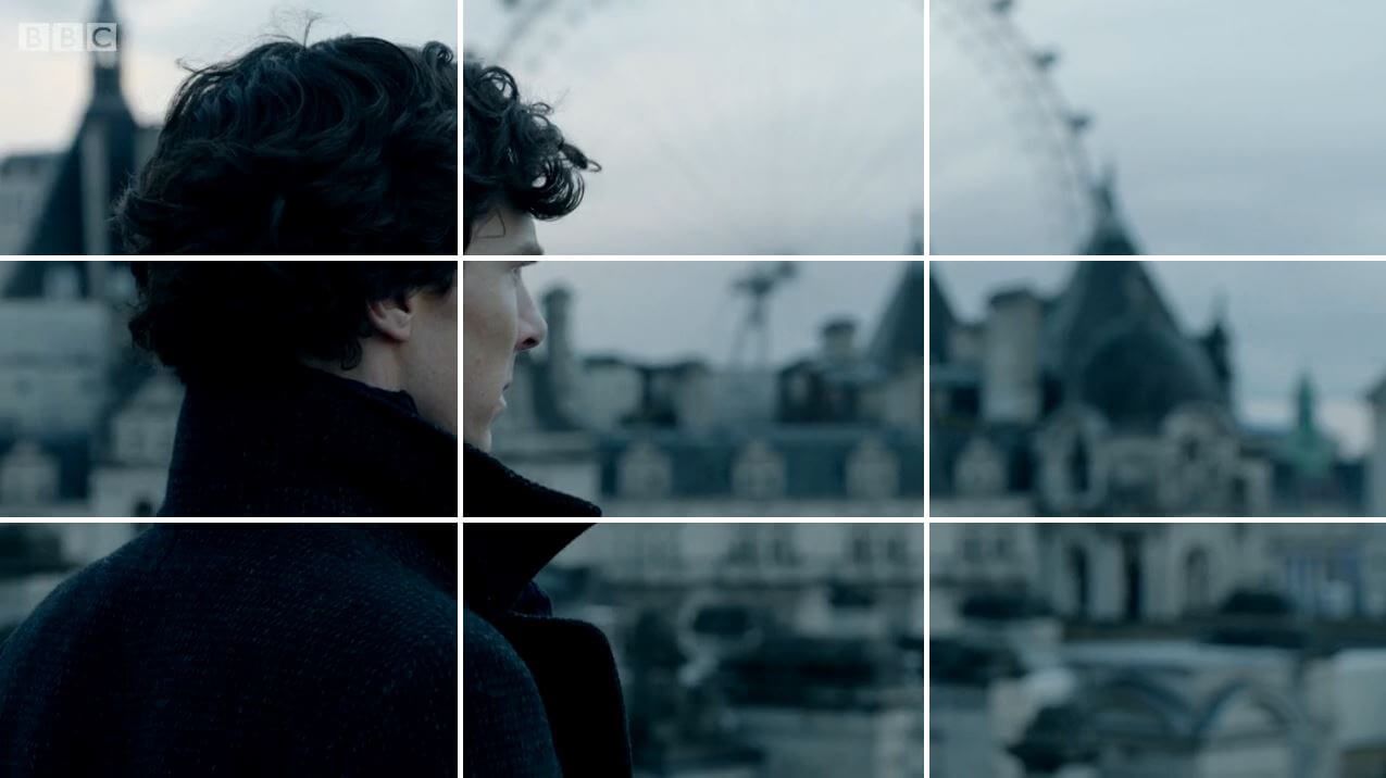
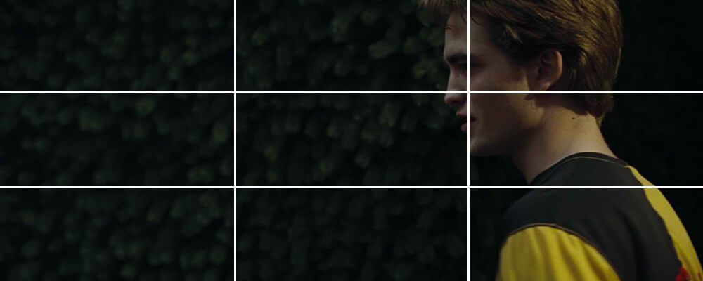
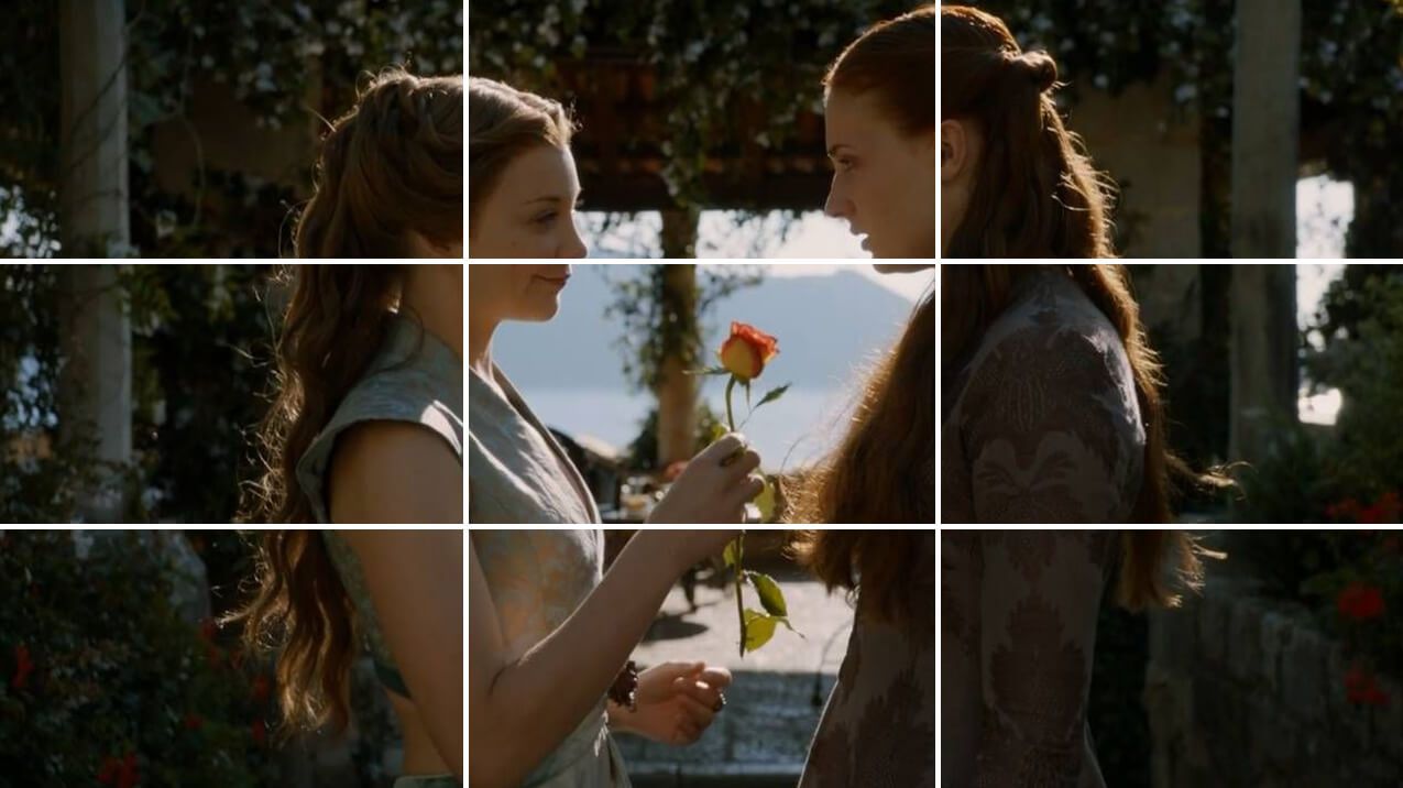
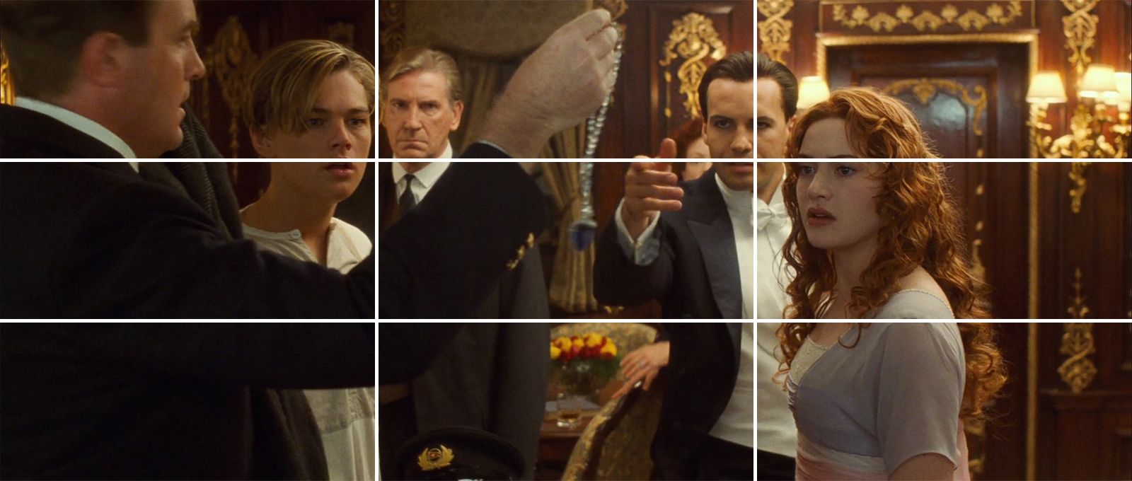
The rule of thirds is the basic rule of composition in film production. Divide the frame visually into thirds horizontally and vertically, so the image is divided into nine equal parts, which creates control points.
Place your main objects along or within these lines, or their intersection. Almost all filmmakers and experienced videographers use this rule for filming to make the image more interesting and dynamic.

Why this rule works
The rule of thirds softens the image and creates a spectacular composition, making the frames visually more attractive. If you place an image outside the center of the shot, you increase the level of the audience’s perception.
The viewer will be completely immersed in what’s happening on the screen, get aesthetic pleasure, and the eyes won’t get tired when watching. And the information conveyed at the same time will be understood much better.
Rule of thirds is similar to the Golden section, which was used by artists of the Renaissance. Why not follow this method and create own masterpiece?
Use this compositional rule when creating videos, vlogs, promos, and animation. This rule is effective everywhere, not just in the film industry, but in design, photography and visual art as well.
Sometimes the laws don't apply.
The rule of thirds is not mandatory and when the composition demands it, it can and should be violated. An example of such a violation is a shot of a flat water surface in which the sky with clouds is mirrored. You cannot use the rule of thirds here, as you could lose the beauty and uniqueness of this subject. In this case, the horizon line is exactly in the middle of the picture, and the sky and its reflection in the water turned out to be perfectly symmetrical about the horizon. When it is easier to shoot and all pictures are successful, you should take a risky step. You need to completely forget about this rule. This is the advice of world-class photographers whose work receives gold medals at international exhibitions.
Most people who do photography are well aware that composition is fundamental. Unless you are a beginner, you might have some doubts about where to start when studying this kind of art. And even though everyone is familiar with the principle that the object should not be placed directly in the center of the frame, it is still worth recalling what the Rule of Thirds is based on and how it is applied in portrait and street photography or filmmaking.
How to apply to shots
When you shoot a video, just turn on the grid function on your camera and and place the key elements along the lines or in the intersections, the majority of the extra room should be in front of the subject with the vertical line running through their perceived center of mass.

If you’re shooting a moving object, consider the direction of moving. Make sure the object has more space in front of it.
For example, if you’re shooting a person walking to the left, place it in the right vertical third. It will give the feeling that the object is moving towards the center and so will do the viewer’s eye. This looks very natural.

By placing important objects and characters that you shoot at the intersection of the dividing lines in the grid, you can make the image more dynamic and attract viewers' attention.
Placing two objects along vertical lines let the viewer pay equal attention to both of them. When you place an object in the center, it becomes the key point and other subjects seem less important.

How to correctly position the horizon line using the rule of thirds? The horizon can be put both in the top third to increase attention on the ground and in the bottom third to focus the attention on the sky.
Use this rule for each shot: wide, medium and close-up.
If you shoot a character's face in the middle, place it on one of the upper intersections of the lines.
When shooting close-up, the top line of thirds should be in the eye area. Focus on the eyes of your character. At the same time leave more space where the eyes are directed.

The rule of thirds will help you achieve a balanced arrangement of significant objects in the shot, making them more harmonious for perception.
Rule of Thirds Examples in Cinema
- The Godfather (1972) - The opening scene of the iconic film shows Don Corleone seated in the center of the frame, surrounded by his family on either side. This is a classic example of using the rule of thirds to draw the viewer's attention to the central character and create an aesthetically pleasing composition.
- Jaws (1975) - This classic thriller uses the rule of thirds to build tension and anticipation as Chief Brody stares out into the ocean from his boat. By placing him in one-third of the frame, it creates a sense of dread as we wait for something to appear in the other two-thirds.
- Psycho (1960) - In this iconic shower scene, Norman Bates is placed in one-third of the frame while Marion Crane’s silhouette fills up another third, creating a sense of symmetry and balance that adds to the suspenseful atmosphere.
- The Shawshank Redemption (1994) – In this memorable scene, Andy is framed in one-third of the shot while Red stands in another third looking out towards freedom with hope and longing; a perfect example of how effective framing can be used to convey emotion and meaning in film.
Practice, practice, practice
Train first, you must develop a skill. Then the alignment of the correct composition will occur automatically. Everything comes with experience.
When watching movies, pay attention to how the Director uses the rule of thirds. Remember these moments, and then repeat when you shoot yourself.
Keep the rule of thirds in mind when creating your video. Of course, rules can be broken sometimes, but if you’re not sure whether the image could benefit from going beyond the composition, then follow this basic concept. It will let you come out with stunning shots.


